


Overview
Transforming a desktop-only legacy product into a responsive, accessible experience
Over one million students use Smartwork — an online learning platform for students and instructors across higher education. For the past 17 years, Smartwork has been desktop-only, limiting when and how students could complete assignments.
As student expectations shifted to mobile-first experiences and competitors introduced native apps, Smartwork began falling behind. At the same time, institutions required accessible learning tools, putting additional pressure on the platform to meet modern standards.
This project focused on transforming Smartwork into a fully responsive and accessible experience while preserving the familiarity required by a large, existing user base.
Impact
students gain access to mobile and tablet devices
WCAG 2.1 AAA accessibility compliance achieved
The Problem
A desktop-only, inaccessible platform, with heavy technical constraints
W.W. Norton's legacy product was not accessible or mobile-friendly, blocking a significant portion of students and failing to meet institutional requirements. The platform needed a full responsive and accessible overhaul — without disrupting the familiar workflows of over one million existing users, and within the tight limitations of a legacy system.
Users
Smartwork operates as a multi-sided system, with distinct user needs:

Instructors
Course educators
Customize assignments by curriculum
Monitor class performance & analytics
Maintain control over content structure

Students
Primary learners
Complete assignments efficiently
Resume progress seamlessly
Interact with complex question types

Content Writers
W.W. Worton Internal
Align content with textbook material
Maintain consistency across disciplines
Support scalable content creation
Research & Audit
Understanding the full scope before redesign
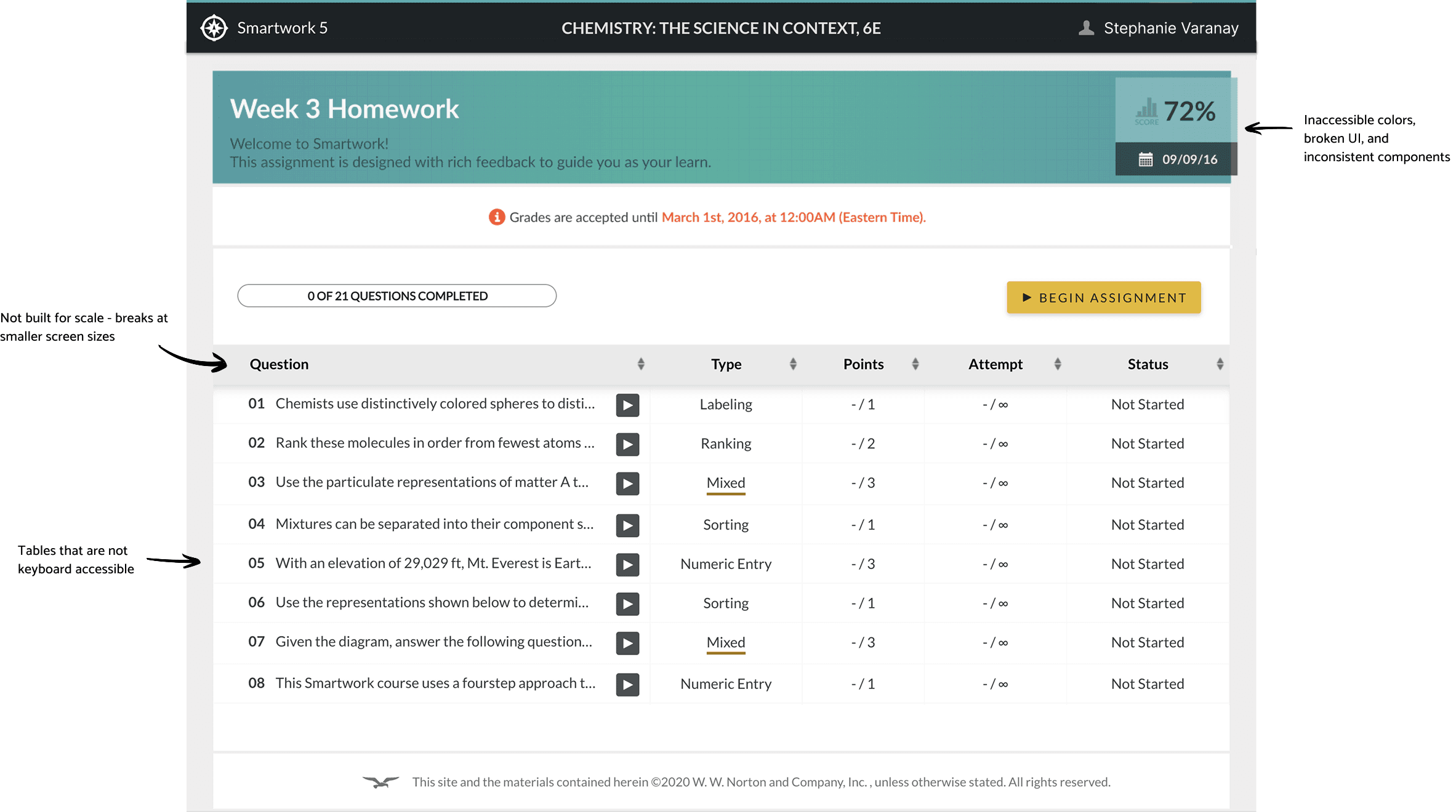
To understand the scope of the problem, I conducted a full audit of 100+ student-facing screens, covering: assignment homepage, question player, all 13+ question types, edge cases across interactions.
Then to understand how to approach responsive behavior, I also conducted a targeted competitive analysis of table interactions and dense data layouts. This was important for the Assignment Homepage, where traditional table structures failed on smaller screens.
It became clear that maintaining strict structural fidelity to desktop patterns would not work on mobile and that the experience needed to adapt to prioritize readability and interaction.
From this audit, several patterns emerged:
Component inconsistency
Buttons, inputs, and layouts varied significantly across screens
Responsiveness breakdown
Tables, interactions, and layouts failed on smaller screens
Accessibility failures
Missing labels and ARIA attributes, failed color contrast, and non-navigable for screen readers
Cognitive overload
Excessive icons, dense layouts, and unclear hierarchy
System Constraints
Constraints of a legacy product controlling the direction of the redesign
1
Assignment layout and behavior had to stay the same - including all visual cues and information.
2
Updating the header required a full custom rebuild - which was out of scope.
3
All existing information in the question table had to stay and be visible to students.
4
Question layout and behavior had to stay exactly the same for the 1M+ existing users.
5
Question language for buttons, links, and descriptive text had to stay familiar.
6
Bottom navigation had include all existing buttons, links, and text.

Designing for Smartwork required navigating tightly coupled technical, organizational, and behavioral constraints.
The platform was built on a legacy system, making even small interface changes difficult to implement without significant engineering effort. As a result, developers were cautious about modifying existing components, and stakeholders were resistant to large-scale visual changes that could introduce risk. At the same time, over one million students were already familiar with the platform. Any major changes could disrupt established workflows and increase friction during assignment completion.
This created a constant tension throughout the project: improving usability, accessibility, and responsiveness while preserving familiarity and system stability. Rather than approaching this as a full redesign, the work focused on making targeted, high-impact improvements that could evolve the product without breaking it.
design Challenges
The most critical design challenges
Designing for scale
100+ screens, 13+ question types, and multiple flows within a legacy system - all requiring coordinated, phased delivery.
100+ screens
13+ question types
6 phases
Balancing familiarty vs improvement
Preserving existing mental models that students relied on while modernizing patterns that no longer served them.
Legacy constraints
UX continuity
Accessibility across complex interactions
Every question type had to be fully completable using assistive technologies.
WCAG 2.1 AAA
Assistive tech
All questions
Cross-device consistency
Rebuilding layouts to function across desktop, tablet, and mobile without losing the integrity of the learning experience.
Desktop
Tablet
Mobile

Design strategy
Three principles to address key challenges
Simplification
Reduce cognitive load by removing unnecessary elements and clarifying hierarchy
System Consistency
Standardize components and interactions across all screens
Responsive Re-architecture
Adapt layouts and interactions for smaller screens without losing functionality
Strategy Execution
Six design phases rolled out incrementally
Given the scale of the work, I structured the project into six sequential phases, beginning with the Assignment Homepage and Question Player, which are foundational to all student interactions.
This approach allowed updates to be rolled out incrementally without disrupting active users. It also enabled design decisions made in earlier phases to be reused and scaled across more complex question types later in the project.
Wireframes & Iteration
Testing layouts and validating structural decisions
Early exploration focused on simplifying dense layouts, reorganizing content hierarchy, and adapting key flows for smaller screens. Wireframes played a critical role in validating structural decisions before applying visual design, allowing me to test different approaches to layout, responsiveness, and interaction patterns while working within system constraints.
image here
design solutions
Rebuilding to work across desktop, tablet, and mobile
The most critical challenge was taking a desktop-only platform with dense tables, complex layouts, and broken mobile interactions - and making it work across every device.
Solution
Card-based layouts for mobile
Progressive disclosure of information
Touch-friendly interactions
Old design

New design

Designing for WCAG compliance
All Smartwork questions needed to be AAA WCAG compliant. They failed our … They were not usable with screen readers and not functional on mobile.
Solution
Increased touch targets across all interactions
Full keyboard navigation support
ARIA labels for all interactive elements
Improved color contrast ratios
Clear focus states and navigation cues
Accessible modals, tooltips, and inputs
Rethinking question interactions
Drag-and-drop interactions posed a major challenge. They were not usable with screen readers and not functional on mobile.
Solution
Replaced drag-and-drop with structured selection patterns (drop downs):
Enabled keyboard and screen reader compatibility
Supported all edge cases
Maintained learning integrity
Labeling Question Type
Old design

New design

Ranking Question Type
Old design

New design

design system improvements
Scalable, accessible, and modernized design system components
Rather than visual updates alone, this work strengthened the system:
Standardized components across 100+ screens
Aligned UI with Norton Design System
Reduced visual noise and redundancy
Improved scalability for future features
This created a more maintainable and consistent product foundation

drag me!
Image above includes a small representation of the design components from this project
drag me!
cross-functional collaboration
Collaboration with product & engineering was essential for a successful redesign
Given the scale of the project and the constraints of working within a legacy system, close collaboration across accessibility, product, and engineering was critical throughout the entire process.
I worked closely with engineers to understand system limitations and feasibility, while aligning with product managers on priorities, timelines, and scope. Many design decisions required tradeoff discussions, balancing usability improvements with implementation complexity.
Each phase included multiple rounds of review, where I presented interactive prototypes, walked through design decisions and edge cases, and aligned on implementation details before handoff.
Accessibility Integration
Dedicated reviews with accessibility specialists
Accessibility was not treated as a final validation step, but as a continuous part of the design workflow. After each design phase, I conducted dedicated review sessions with our accessibility partner to evaluate all updated screens and question types.
During these sessions, we validated screen reader compatibility, keyboard navigation, labeling, focus states, and contrast compliance to ensure alignment with WCAG 2.1 AAA standards. Designs only moved forward once they passed accessibility validation, allowing issues to be identified and resolved incrementally rather than at the end of the project.
This approach was especially important given the complexity of the question types, where interaction patterns varied significantly and required careful consideration to ensure all users could complete tasks independently.
Handoff & Implementation
Annotated designs, summary documentation, and QA
For each phase, I provided detailed annotated designs in Figma along with summary documentation outlining key updates. I also walked through the designs with developers to ensure clarity around interactions, behaviors, and edge cases.
During development, I remained closely involved by answering questions, reviewing Jira tickets, and conducting VQA on implemented features to ensure design fidelity and accessibility compliance.

