
White Heron Mobile App
A Redesign for an Online Ordering System
The Goal
Create a smooth online ordering experience for White Heron, a prominent coffee shop in Portsmouth, NH. A mobile app with a focus on:
let users locate items and order on the go
allow for all dietary substitution
loyalty program for returning customers online
Why was a redesign needed?
The menu is displayed in a way that poorly shows products available to purchase, making the design cluttered and difficult to navigate.
There is no search bar or filter option, making it difficult for users to locate products.
The available substitutions within the store are not listed on their mobile app, making it challenging for users with dietary restrictions to correct their order.
The loyalty program that is available to customers in-store is not available to use virtually.
Project Overview
White Heron is a local coffee shop located in the quaint New England town of Portsmouth. White Heron strives to bring local coffee and teas, fresh breakfast, and lunch options from local vendors. White Heron targets all types of customers; locals, commuters, remote workers, families, and tourists.
To obtain my Google UX Certification, I chose to redesign the mobile ordering app for White Heron. I believe a new system will help their business grow in sales, customer satisfaction, and overall improved experience.
My Role
Role: UX/UI Designer
Client: White Heron Cafe
Tool: Adobe XD, Sketch
Starting Point
I conducted interviews and created empathy maps to understand the users I’m designing for and their needs. This information helped me map out the main pain points users faced while using White Heron’s current Mobile App.
Using all of the information gathered during the research phase, I was able to determine what needed to be included in our redesign. This information was organized into a sitemap, which served as a guide in creating the initial wireframes.
I wanted the new interface to be clear and concise for users, as many found the old interface difficult and confusing, so for the home screen, I prioritized a quick and easy ordering process with an option to see previous orders with saved substitutions for users to save time.
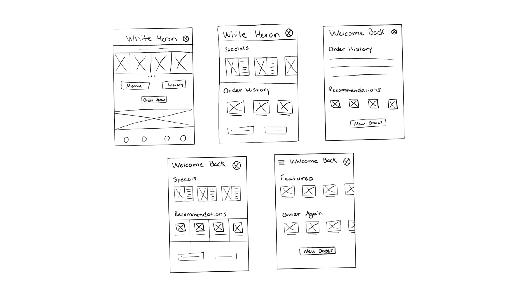
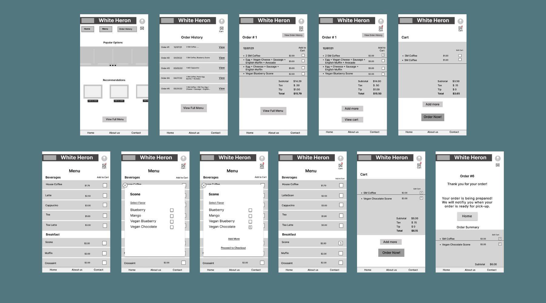
Digital Wireframes
I then began exploring the general appearance of the app. I included information that would help direct the flow of the app and the fluidity going from screen to screen. Once the layout was identified in a way that prioritized important content and created a user-friendly experience, I dove into high fidelity designs.
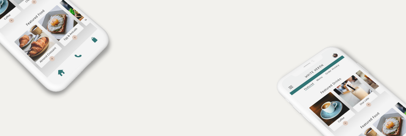
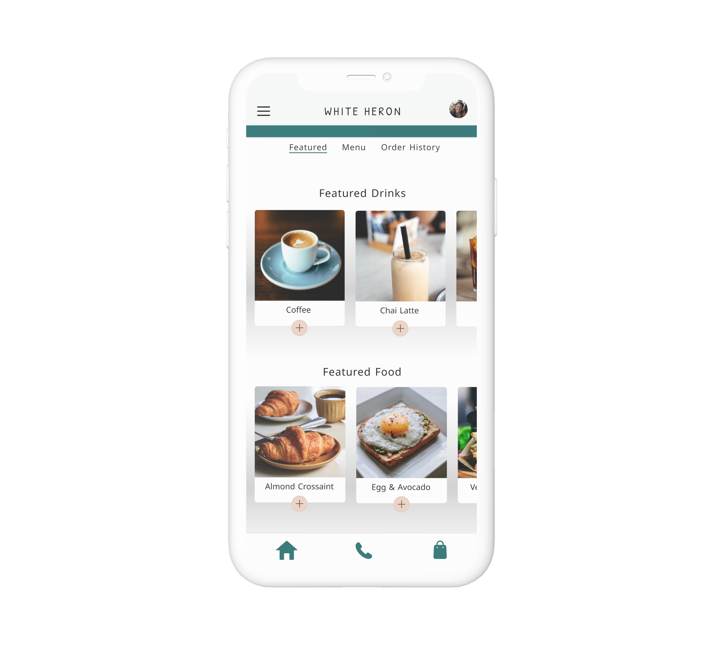
Interface
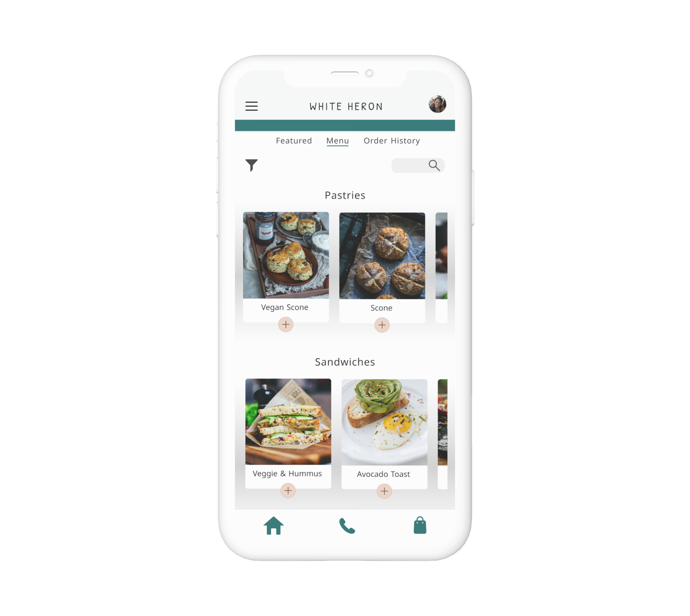
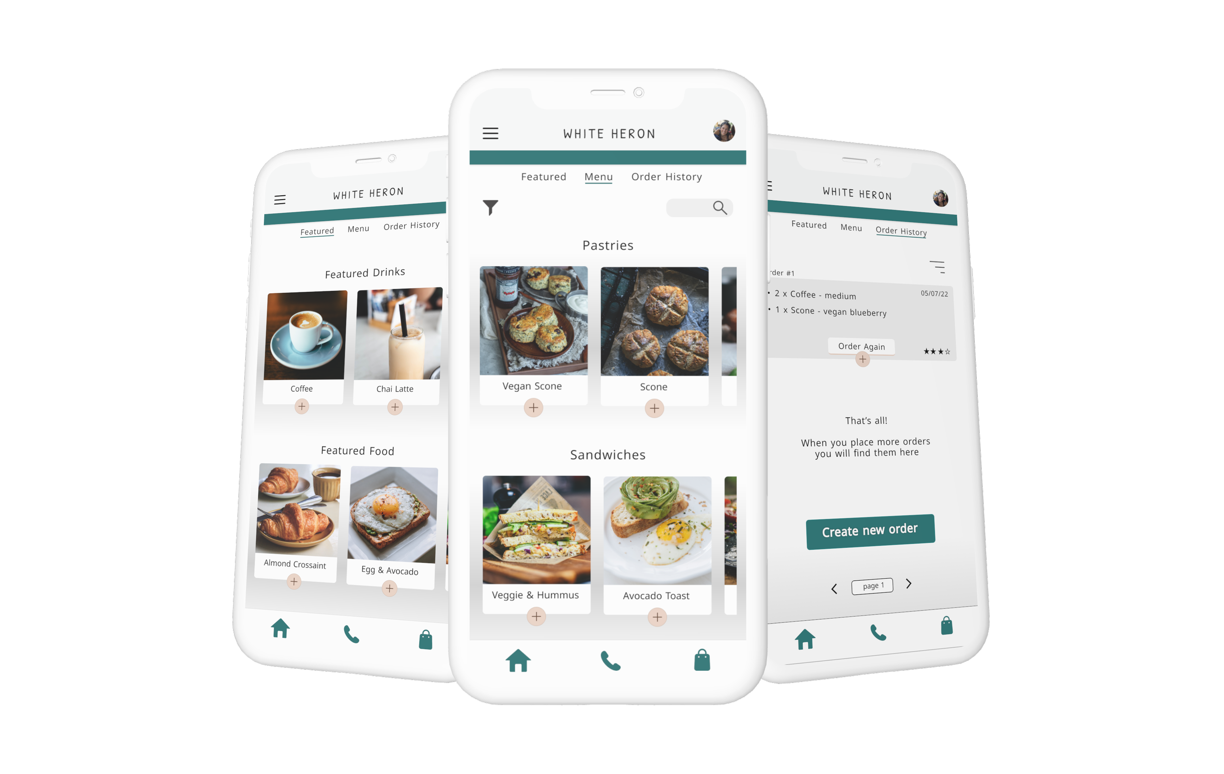
Designing a visually clear and user-friendly platform was essential for the success of this app. With a significant proportion of users (3 out of 5) unable to locate the desired item in the current app, it was clear that a more efficient navigation system was needed in order to achieve the primary goal of the mobile ordering app.
To solve for this problem, these features have been included:
A visual layout with images and descriptions for all products
A search bar for a quick find
A filter option for a specific type of product
Challenge 1
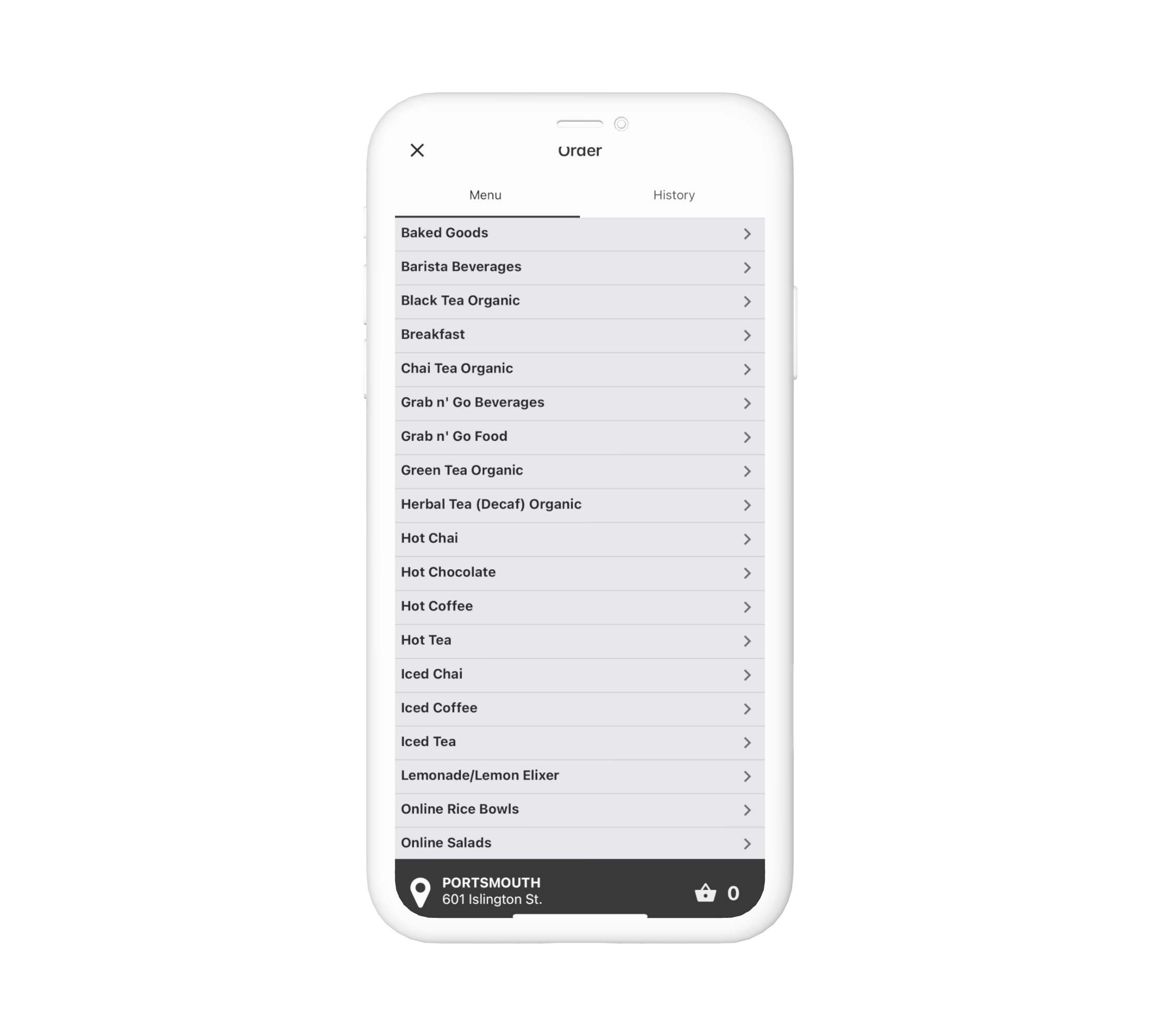
old design
new design
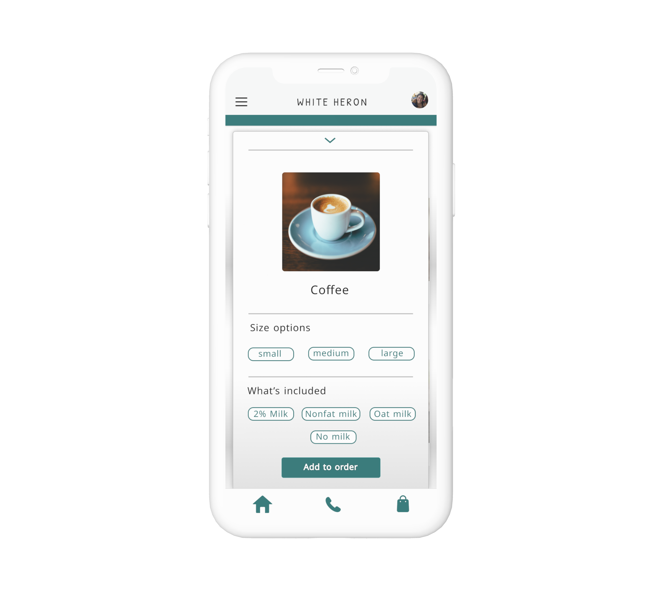
Substitutions
In today’s world, we accommodate to the many dietary restrictions people face by offering a variety of options and substitutions. One challenge we face is to help customers easily find the menu items that meet their dietary needs and create a positive experience.
To solve for this problem, these features have been included:
Clearly label menu items that are suitable for specific dietary restrictions, such as gluten-free, vegan, or dairy-free.
Provide an option for customers to filter menu items based on their dietary restrictions.
Allow customers to make substitutions or modifications to menu items during the ordering process.
Challenge 2
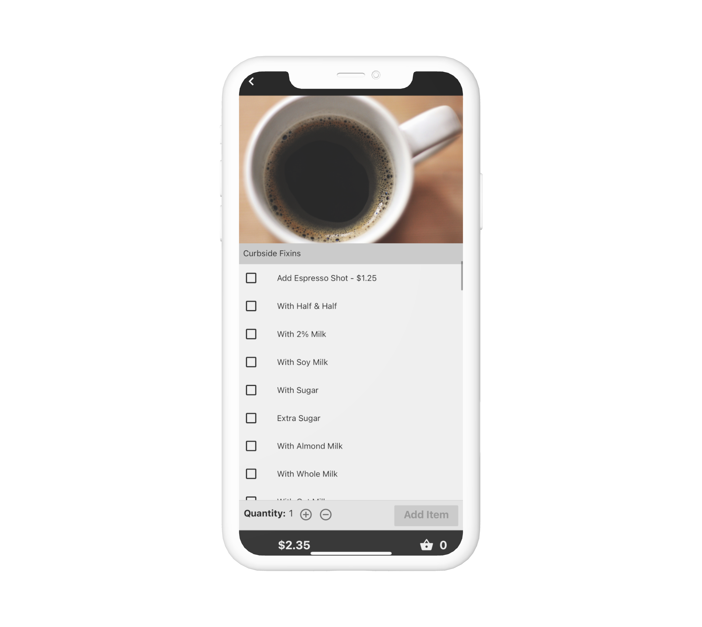
old design
new design
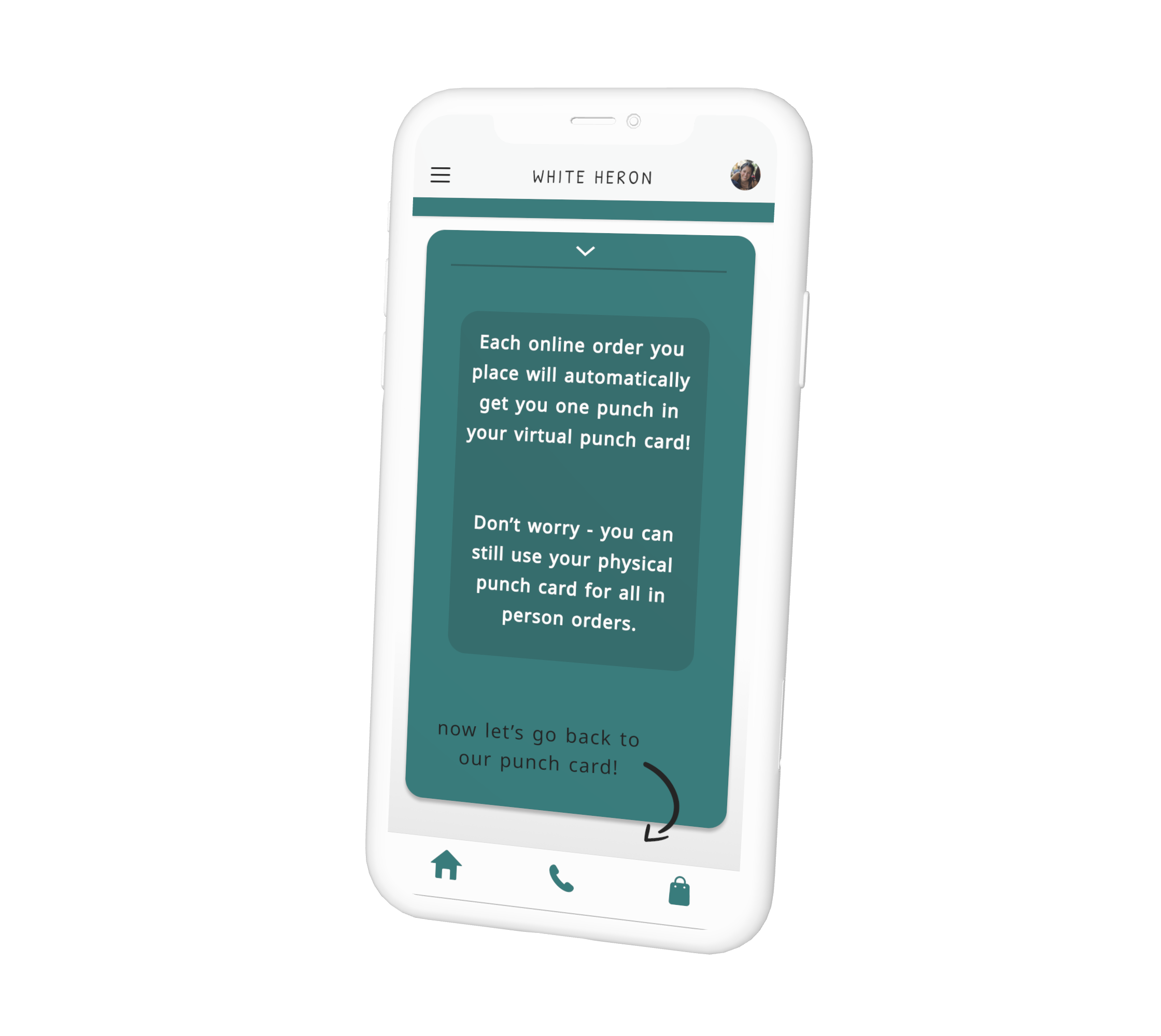
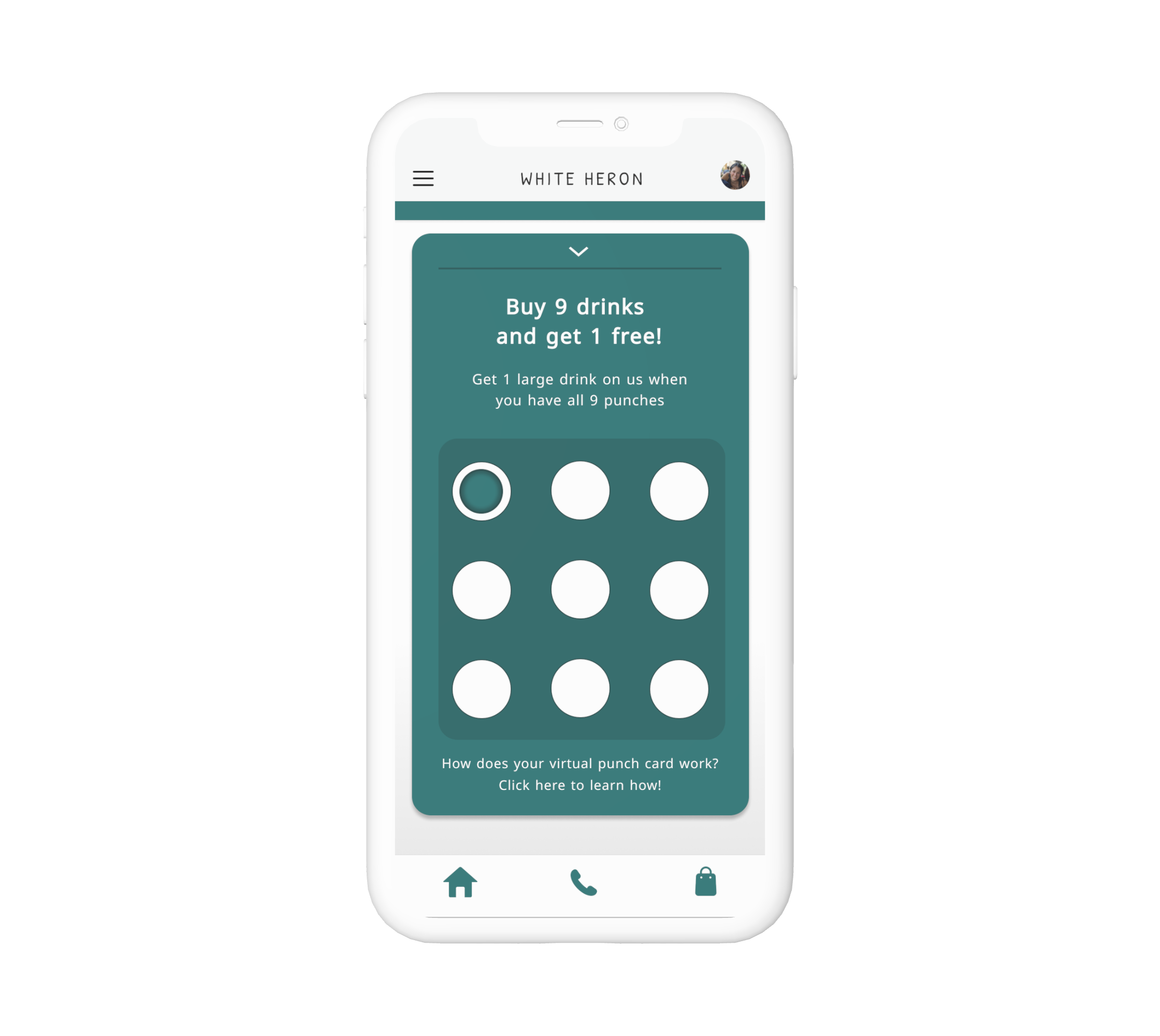
Loyalty Program
White Heron uses physical punch cards for their current loyalty program where customers can redeem free items. This program is loved by all customers, including me! However, The mobile app does not support the current loyalty program, which can only be used in-person. The challenge is to integrate the loyalty program into the mobile app in a user-friendly and manageable way.
To solve for this problem, these features have been included:
Allow customers to use a virtual punch card via the mobile app.
Redeem a virtual “punch” after placing an online order.
Scan a QR code when the punch card is full to redeem your reward, which then resets your card back to empty.
Challenge 3
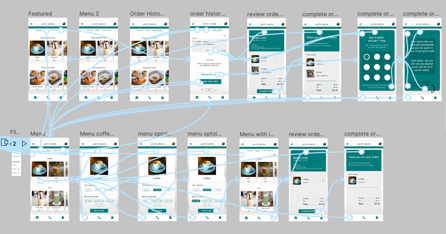
Wireflow
In this phase I used all user information to help direct the flow of the app and the fluidity going from screen to screen.
Takeaways
I thoroughly enjoyed creating this app for my Google course. Through this project, I gained a deeper understanding of user personas, user research, and collecting feedback to iterate designs. I also learned the importance of user-centered design and the process of prototype testing.
The highlight of this project for me was being able to understand users' pain points and find creative solutions to improve their experience. This is an aspect of design that I really enjoy. Knowing that you’re not only making things better for the customer but also driving business growth and enhancing their overall experience.
I know that this app was designed for my UX/UI Google Course, but I have shared all information and prototypes with White Heron. I am happy to have provided them with these resources that they can freely use if they’d like to!