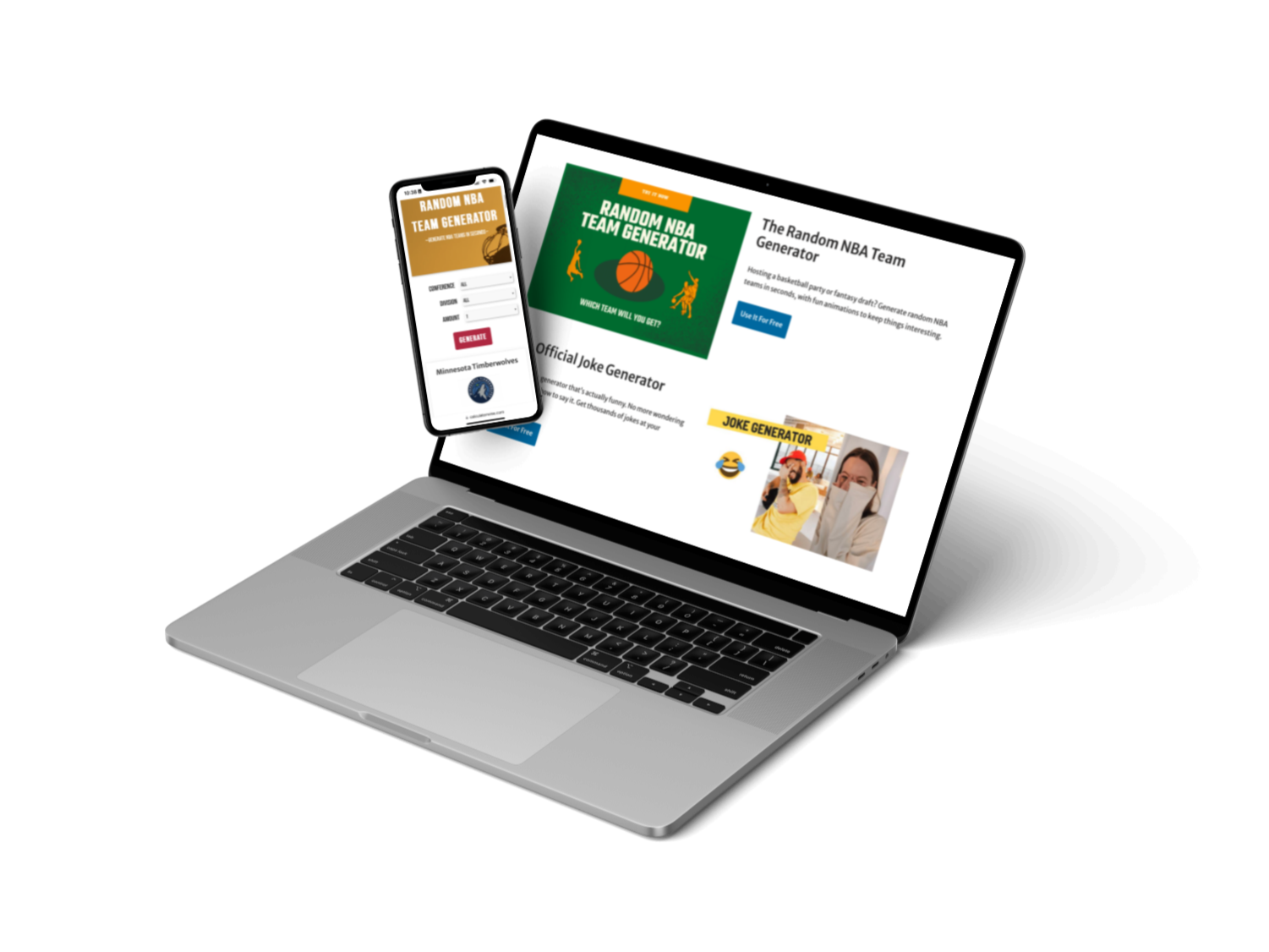
CalculatorWise
CalculatorWise is a versatile website that offers a variety of tools to help users discover solutions, generate content, and spark creativity.
The Problem?
Many content creation platforms are complicated and overcrowded, making it difficult for users to find a user-friendly platform that meets their needs.
Common challenges include cluttered interfaces and tools that are hard to use, resulting in inefficient content creation processes that are time-consuming.
How might we design an intuitive platform where users can access tools that help them generate content quickly and efficiently?
My Role & Process
As the sole UX/UI Designer on this project, I collaborated with the developer weekly. To start the project, I defined our goals and outlined the necessary steps to achieve them.

Discover

Research
Competitive Analysis

Design

User Flows
Wireframes
Prototypes

Validate

User Testing
Design Iterations
Research & Competitive Analysis
We wanted to explore common competitor websites and gain insight into how they designed their tools, calculators, and generators with the goal of building a user-friendly tool that encourages repeat users.
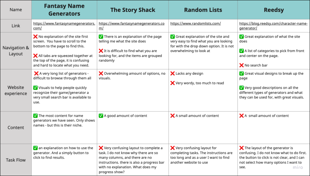
I researched top competitors and created a competitive analysis.
The main object for the analysis:
Identify which layouts are user-friendly and easy to navigate.
Which layouts allow users to complete tasks with minimal confusion or frustration.
Identify positive features that will make users want to return.
User Experience
We struggled to locate what we were looking for and there weren’t any cues to help users browse categories. These findings taught us to focus on building features and tools to help people browse more effectively.
Task Completion
The layouts for completing tasks were confusing and lacked clear instructions. We will prioritize creating an instructional layout and include cues to help people complete their tasks without confusion.
Features
All competitors only offered one feature -name generators. This encouraged us to think outside the box and come up with unique features to include on our site and make them stand out.
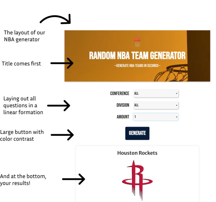
User Flow
The developer and I needed to design the most efficient path for users to complete their desired task
I created a layout to help us visualize a user’s task completion flow.
The main aspects to include in the layout:
confirm with the developer that all designs are within the development capabilities
Implement findings from our competitive analysis.
Include concise instructions
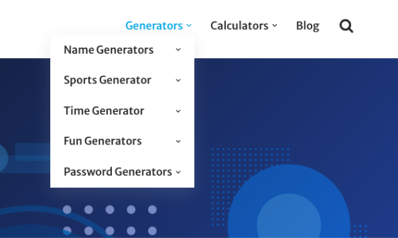
Navigation
Based on the findings from our user research, we included features and tools to help users easily browse and locate categories in our sketches.
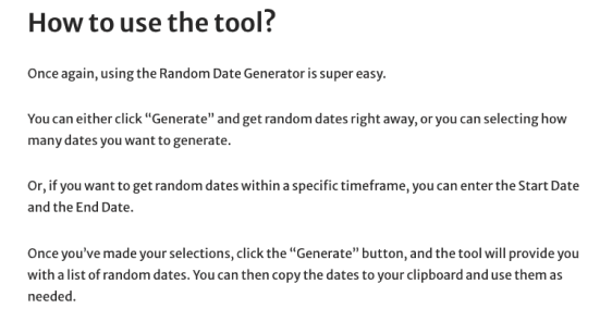
Instructions
Based on the findings from our user research, we included features and tools to help users easily browse and locate categories in our sketches.
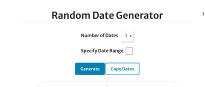
Task Flow
Our design included an instructional layout for all tasks and with each question stacked on top of one another in order of priority. We felt this was the best method for people to understand how to compete the task without confusion.